Android application
Android
Scheduler
Redesigning a scheduling experience around clarity, hierarchy, and discoverability.
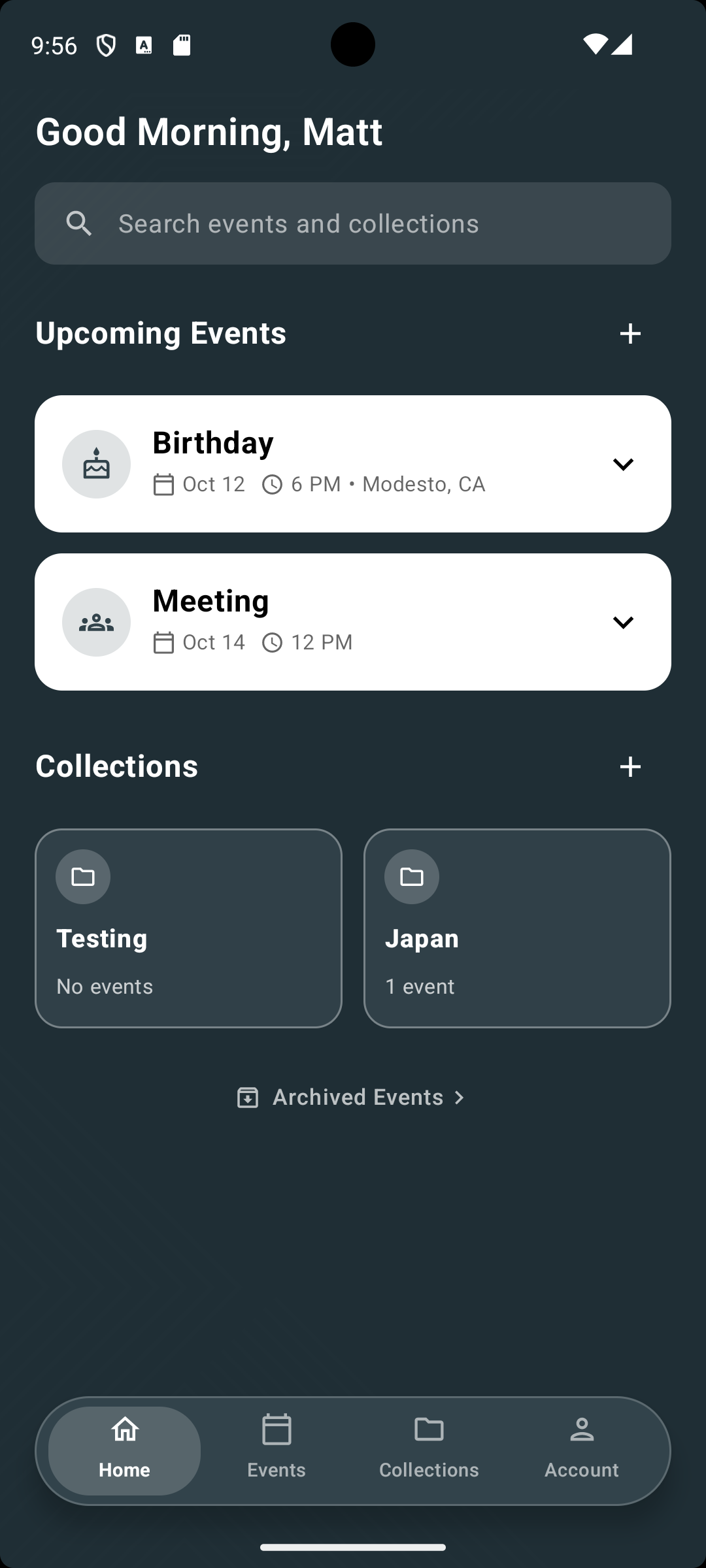
The starting point.
The original application was a functional starting point. The redesign focused on making its organization, destinations, and interactions easier to discover, without treating the earlier work as something to dismiss.
Its evolution centers on a simpler question: can the interface make the next useful action obvious?
From functional
to findable.
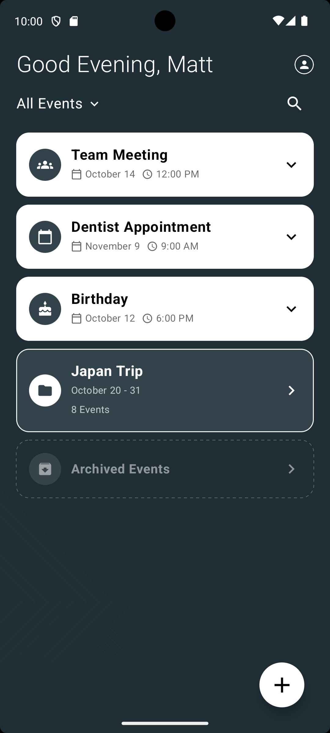
- Persistent navigation
Four visible destinations replace reliance on dropdown navigation, making the application's structure easier to understand.
- Clearer content hierarchy
Upcoming events and collections are separated into distinct sections, prioritizing scheduled activities while keeping organization accessible.
- Discoverable interactions
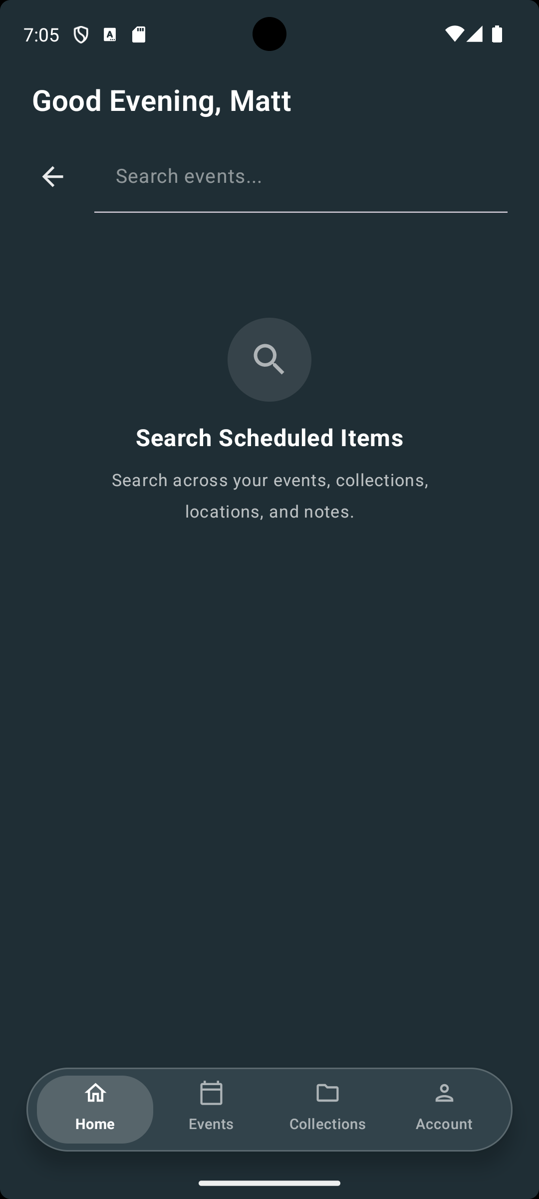
A visible search field and contextual creation controls replace less prominent actions, making common tasks easier to identify.
Design decisions.
Navigation & information architecture
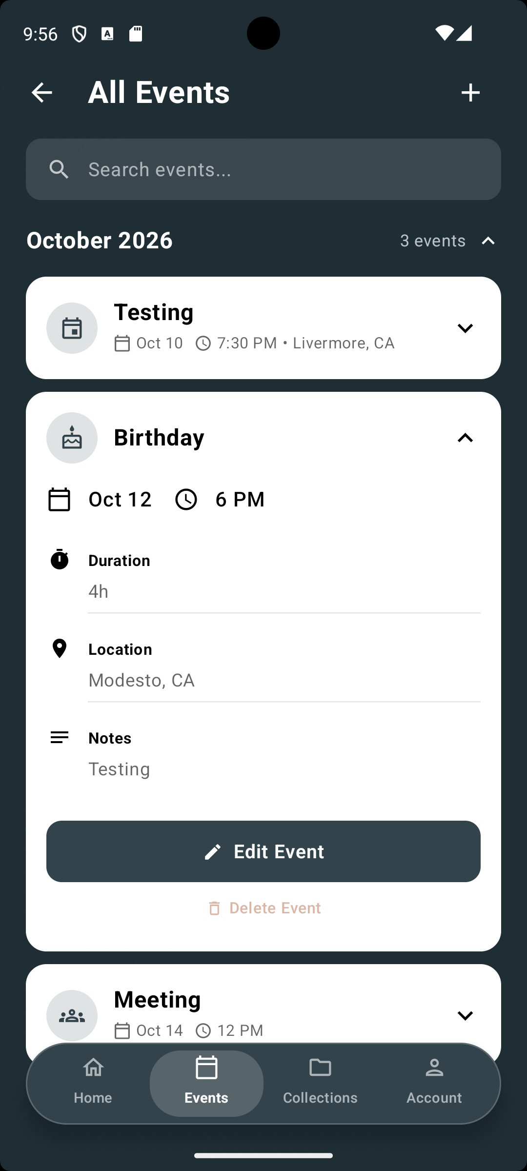
Reorganized the interface around four persistent destinations, separating events from collections and reducing reliance on dropdown navigation. Contextual creation controls and a quieter archive establish clearer priorities without removing functionality.
Reflection &
next steps.
This redesign began with an evaluation of the existing interface against established usability principles, followed by implementation in Kotlin and Jetpack Compose. While the changes were informed by UX reasoning rather than formal user research, their effectiveness has not yet been measured.
Future usability testing would focus on key tasks: finding an upcoming event, creating a new event, searching for an existing entry, and editing its details. Task completion rates, time on task, and points of confusion would help determine whether the redesigned navigation, hierarchy, and interactions improve usability and identify opportunities for further iteration.